Case study · Mobile app · 2026
A wellbeing app that asks the right question before offering an answer.
AThe brief
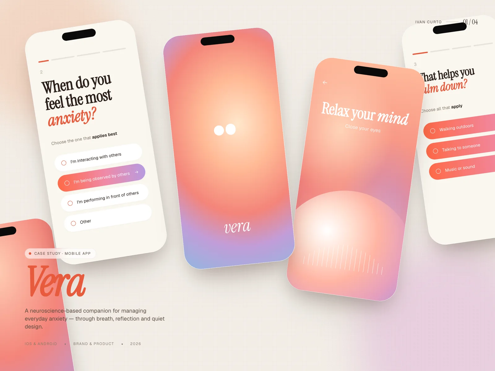
Veraarrivedasonesentence:acompanionforpeoplewhofeelanxietybutnevernameit.Therewasnoflow,noscreensandnobrand,onlytheconvictionthatmostwellbeingappsoverwhelmexactlythepeopletheyclaimtocalm.
The job was to turn that conviction into a product an investor could tap through: a real onboarding, a daily check-in loop and a visual system credible enough to feel like a shipped app rather than a concept deck.
BThe approach
We started with the conversation, not the interface. The onboarding was written as a dialogue — "When do you feel the most anxiety?" — and every screen after it had to earn its place in that dialogue. Anything that felt like a form was rewritten until it felt like a question from someone who listens.
Visually, Vera leans on warm paper tones, a single coral accent and an editorial serif for the moments that matter. Motion is slow and breathing-paced on purpose: transitions ease in at the rhythm the app wants your pulse to follow.
IvanbuiltthefirstversionofVerathatfeltlikeus.Testersstoppedcallingitanappandstartedcallingitahabit.
Mara Puigvert · Founder, Vera
CBuild journal
- WEEK 01
The question audit
We printed every onboarding screen from six competitor apps and crossed out anything that read like a form. Forty-one screens died on that wall. Ours had to sound like a person.
- WEEK 04
Killing the streak
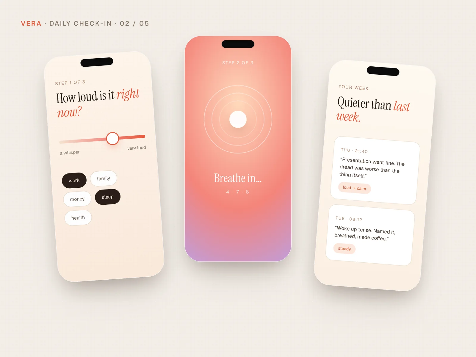
The founder loved streaks; the test group feared them. We replaced the counter with a weekly "quieter / louder" reflection and watched completion climb instead of guilt.
- WEEK 07
The breathing bug
The 4-7-8 animation drifted 200ms out of sync on older phones — enough to feel wrong before anyone could say why. Two days rebuilding it frame-perfect. Worth every hour.
DKey decisions
- 01
One question per screen
Onboarding never stacks inputs. Each screen asks exactly one thing, which kept completion effortless and made the flow feel like care instead of registration.
- 02
Serif for feelings, sans for actions
Emotional copy is set in an editorial serif; buttons and system text stay in a quiet grotesk. The type system alone tells you when the app is talking to you versus asking you to act.
- 03
Breathing-paced motion
Every transition uses a long, soft ease curve timed near a resting breath. Nothing snaps. The interface itself models the state it is trying to induce.
- 04
MVP scope with a hard edge
Streaks, social features and gamification were cut on day one. The MVP defends a single loop — check in, reflect, close — and does it flawlessly.
EThe outcome
A focused foundation that reads as a product, not a prototype.
- 92%
- onboarding completion in first user tests
- 9
- weeks from brief to TestFlight build
- 31
- screens shipped in the design system
Vera left the engagement with an investor-ready build, a UI kit its future team can extend, and an onboarding that testers described as "the first app that did not stress me out while asking about stress."
A note from the build
If I'm honest, the hardest part wasn't the design — it was defending the silence. Every review, someone wanted to add one more card, one more metric. A calm product is mostly the things you refuse to ship.
— Ivan Curto
Have an app idea that deserves this treatment?
Start a conversation