Case study · Premium website · 2024
A studio site with the authority of a printed monograph.
AThe brief
Quintoisanarchitecturestudiowhosebuildingswinprizesandwhosewebsitelostclients.Theoldsitewasatemplategridofthumbnailsthatflattenedfifteenyearsofworkintointerchangeablerectangles.
The studio wanted what their monograph had and their site lacked: sequence, scale, and silence. A digital presence that made a prospective client feel the same authority as holding the printed book.
BThe approach
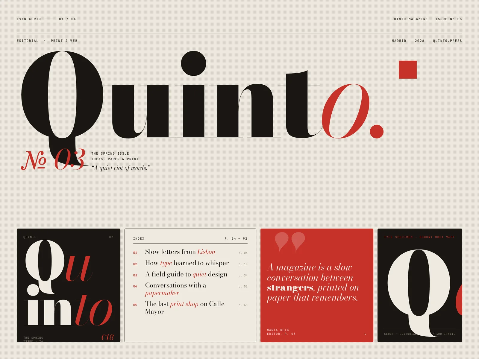
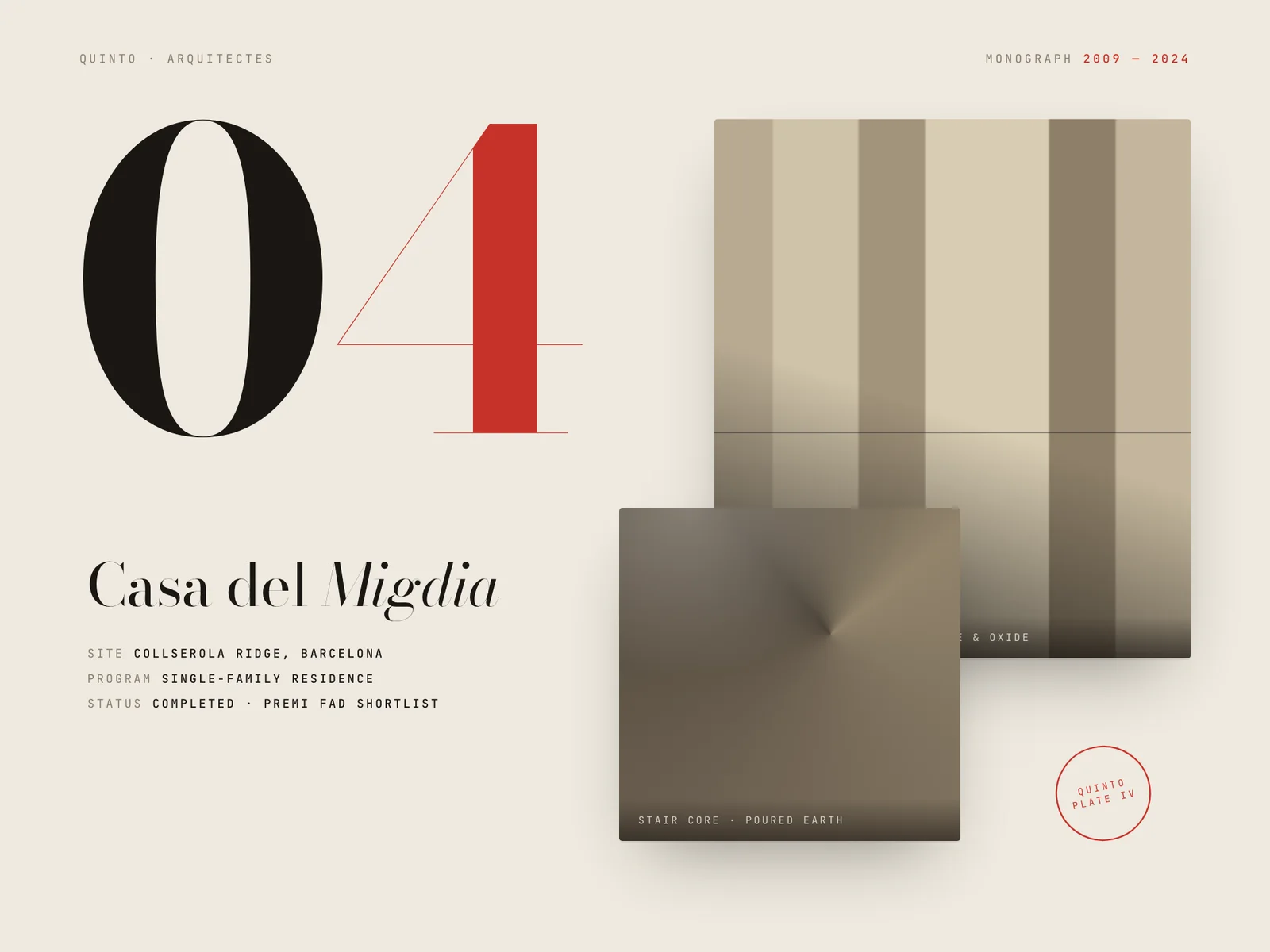
We designed the site as an editorial object. Bodoni headlines at poster scale, a parchment ground, and one carmine accent used the way a printer uses a stamp — rarely, and with intent. Every project reads as a chapter with its own pacing, not a card in a grid.
Motion is restraint made visible: long fades, a slow rule that draws itself under chapter titles, images that settle rather than slide. Nothing moves fast, because nothing in their architecture does.
Thesitereadslikeourmonograph.Clientsarriveatthefirstmeetingalreadyconvincedofthetone.
Pere Vilamarí · Partner, Quinto
CBuild journal
- WEEK 01
The monograph on the table
The partners slid their printed monograph across the table and said 'this, but on a screen'. The first week was spent finding what made it feel heavy: sequence, margins, and patience.
- WEEK 04
One typeface, no mercy
Bodoni at poster size exposes every lazy margin. We rebuilt the grid three times until the type could stand alone — no textures, no overlays, nothing to hide behind.
- WEEK 07
The slow rule
The line that draws itself under each chapter title took a day to build and a week to time. At 400ms it was decoration; at 900ms it became ceremony.
DKey decisions
- 01
Chapters, not thumbnails
Projects open as full-screen chapters with a number, a year and one sentence. The visitor reads the work the way the studio presents it in person — one building at a time.
- 02
Poster-scale Bodoni
The display face carries the brand alone. At 12rem, Bodoni’s contrast becomes architecture itself; no logos, patterns or decoration compete with it.
- 03
Carmine as a signature
The single accent appears only on the active index number and the contact action. Scarcity gives it the weight of a wax seal.
- 04
Silence as luxury
Sections breathe with double-height whitespace and no parallax tricks. The confidence of empty space does the persuading.
EThe outcome
The site now opens the meetings it used to lose.
- 3.1×
- average session length after relaunch
- +47%
- qualified project enquiries in the first quarter
- 2
- design publications that featured the relaunch
Quinto’s partners report that new clients now arrive at the first meeting already speaking about specific projects — the site does the introduction, the studio does the closing.
A note from the build
Luxury on the web is mostly restraint under pressure. The brief will beg for one more effect; the monograph never begs.
— Ivan Curto
Does your work deserve a better first impression?
Start a conversation