Case study · Brand & launch site · 2025
Making a deeply technical product legible in a single scroll.
AThe brief
Nodalbuildsorchestrationinfrastructureformulti-agentAIsystems—aproductitsownfoundersstruggledtoexplaininfewerthanthreediagrams.Thestartupwasweeksfromafundingannouncementwithnonametreatment,nositeandnostory.
They needed an identity and a launch website that made the product legible to two audiences at once: engineers who would try it, and investors who would fund it.
BThe approach
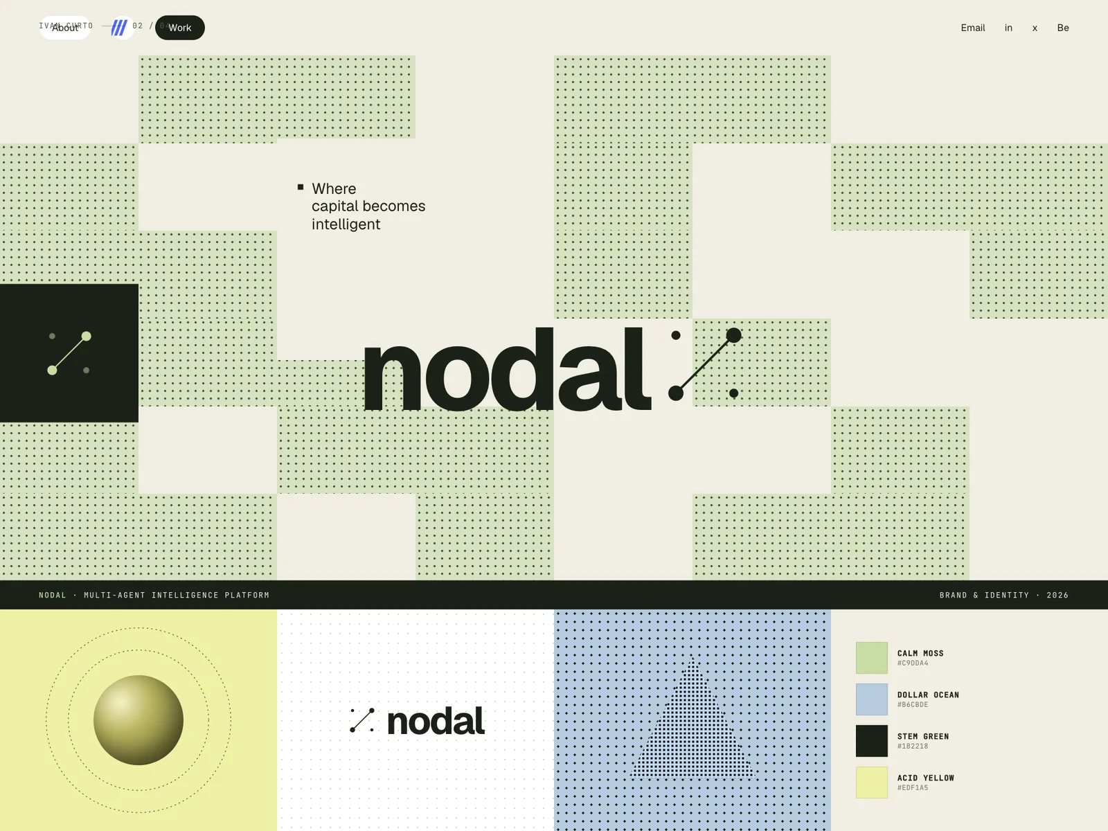
The brand starts from the product truth: nodes and connections. A forest-dark canvas, one phosphor-green accent and a monospaced voice give Nodal the feeling of a terminal you trust — technical, but deliberate and calm.
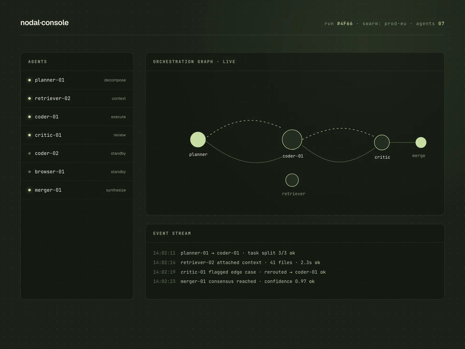
The site is structured as one argument, not a feature list. Each scroll section answers the next natural question — what is it, why now, how does it work, who is behind it — and every claim lands next to a live-looking fragment of the product.
Wefinallystoppedexplainingandstarteddemoing.Thesitedoesthefirsttenminutesofeverycallforus.
Elies Fontclara · CTO, Nodal
CBuild journal
- WEEK 01
Whiteboard archaeology
Three founders, three different diagrams of the same product. Day one was making them argue until one diagram survived. That survivor became the hero animation.
- WEEK 03
The mono decision
We tried three grotesks for headings and everything looked like another AI startup. Setting the whole voice in JetBrains Mono was the day the brand clicked — infrastructure, not marketing.
- WEEK 05
Cutting the second page
The pricing page kept pulling attention from the demo CTA. We folded it into one honest paragraph on the main scroll, and demo requests went up, not down.
DKey decisions
- 01
The diagram is the hero
Instead of a slogan over a stock render, the hero is an animated node graph that assembles itself as the page loads. The product explains itself before a single paragraph is read.
- 02
Monospace as brand voice
All labels, metrics and navigation run in JetBrains Mono. It reads as infrastructure, keeps grids honest and makes marketing copy feel like documentation you can trust.
- 03
One page, one argument
The launch site is a single narrative page. Nothing to hunt through; investors and engineers both reach the demo CTA in under two minutes of reading.
- 04
Performance as credibility
An infrastructure company cannot ship a slow site. Static Astro output, zero client frameworks and system-friendly animations kept it fast on every device.
EThe outcome
A launch that made a hard product feel obvious.
- 2×
- demo requests versus the pre-launch waitlist page
- 38s
- median time to first scroll-through of the full story
- 100
- Lighthouse performance on the launch page
Nodal announced its round on a site that finally matched its engineering. The identity now runs across the deck, the docs and the product itself — one system, one voice.
A note from the build
What I would tell you before a launch like this: your product story is a fight between what you built and what people can absorb in ninety seconds. Win the ninety seconds first.
— Ivan Curto
Launching something hard to explain?
Start a conversation