Case study · SaaS dashboard · 2026
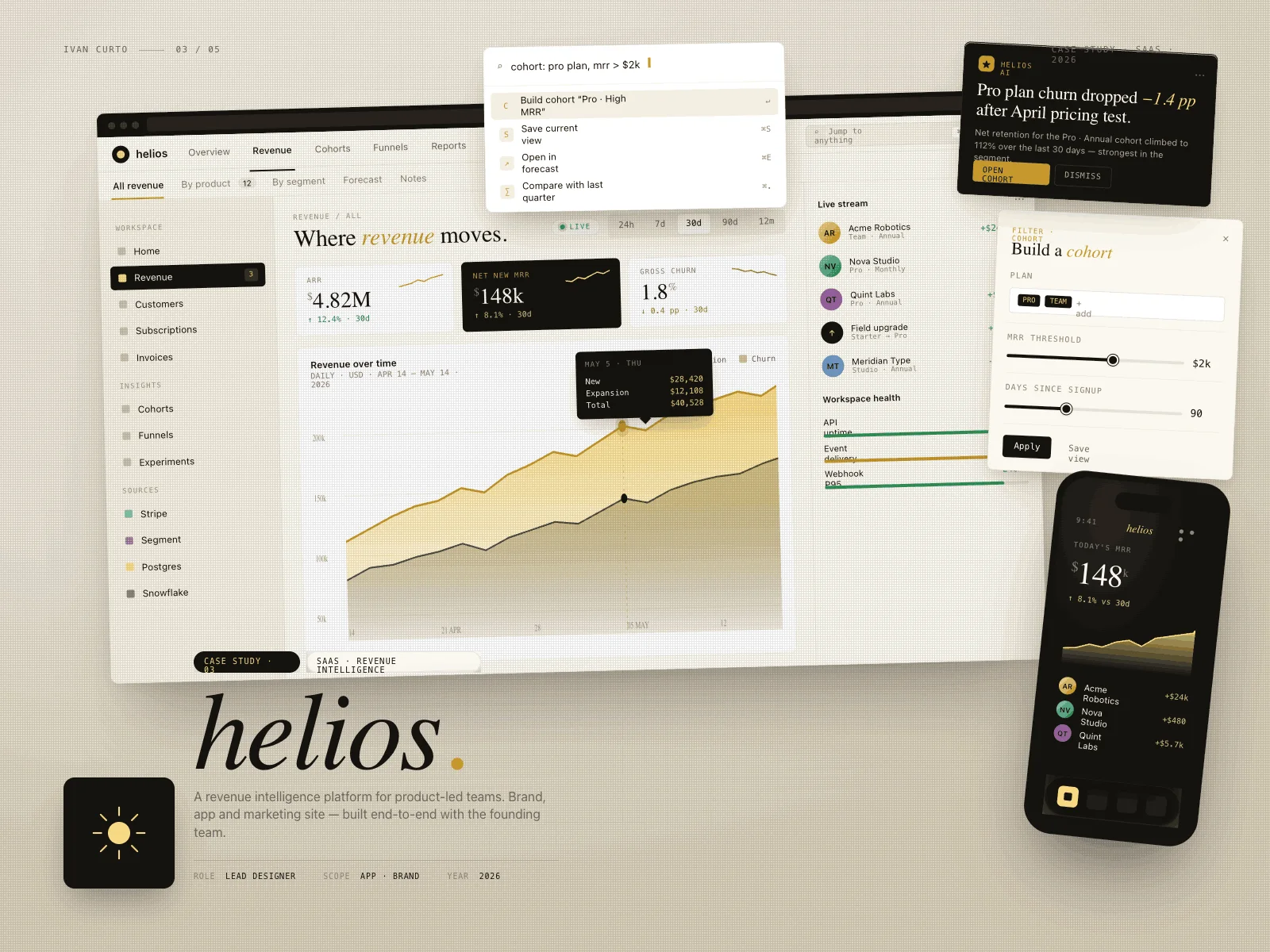
Where revenue moves — one calm surface for the numbers that matter.
AThe brief
TheHeliosteamsoldrevenueintelligencetoproduct-ledSaaScompanies,buttheirownproducttoldthestorybadly:metricsscatteredacrossfivetabs,chartsnobodyconfiguredandachurnsignalburiedthreeclicksdeep.
The mandate was blunt — make the money legible. One surface where a founder reads ARR, net new MRR and churn in ten seconds, and where the interesting anomaly finds you instead of hiding.
BThe approach
We rebuilt the information architecture around questions, not tables: how much, where is it moving, what changed. The main view answers all three above the fold, with an editorial calm — ivory paper, ink numerals, a single gold accent for money in motion.
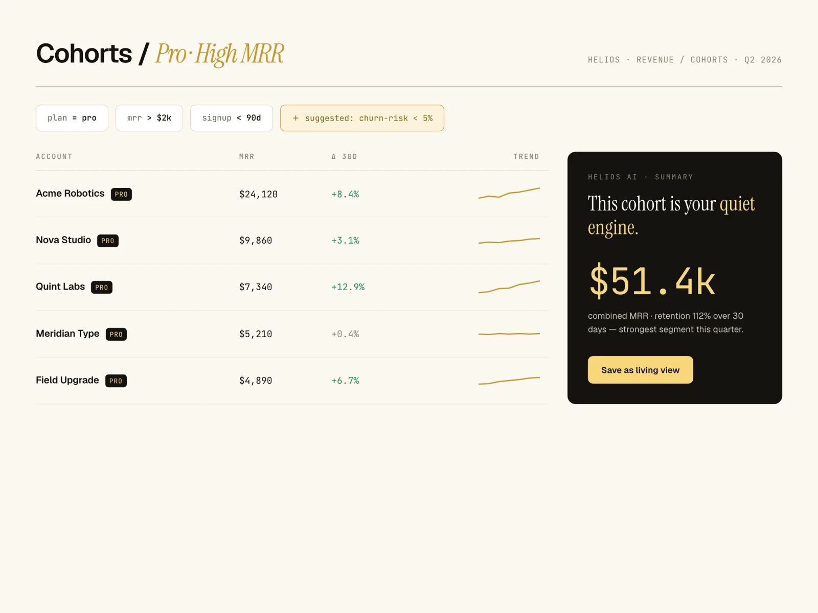
The AI layer was designed as a colleague, not a chatbot: inline cohort suggestions, anomaly cards with a one-line explanation, and a command palette that turns "pro plan churn last 30 days" into a configured view.
Ourbetademowentfromapologytoadvantageinonerelease.Investorsnowasktodriveitthemselves.
Júlia Armadans · CEO, Helios
CBuild journal
- WEEK 02
The tab funeral
We opened the old product with a stopwatch: 43 seconds and five tabs to answer 'how did we do this month'. That number became the enemy the whole team rallied against.
- WEEK 06
Gold gets a contract
Mid-project, gold was leaking into buttons and icons. We wrote a one-line rule — gold only ever means money moving — and reverted fourteen screens. The dashboard got instantly calmer.
- WEEK 10
The founder demo
First live demo with real data: the CEO stopped narrating, turned the laptop around and let the investor drive. That silence was the real acceptance test.
DKey decisions
- 01
Numbers get the typography budget
Metrics are set large in tabular figures with serif italics reserved for narrative labels. Hierarchy comes from type, not boxes — the dashboard has almost no cards.
- 02
Anomalies come to you
A signal rail surfaces cohort shifts and churn spikes as small narrated cards. The user stops hunting; the dashboard reports.
- 03
The command palette is the API
Every view is addressable from one input. Power users never touch the mouse; the AI suggestions ride the same rail, so the smart layer feels native instead of bolted on.
- 04
Gold means money in motion
A single accent colour is reserved for revenue deltas. When something gold appears, it always means the same thing — attention earned, not decoration.
EThe outcome
The dashboard became the sales demo.
- 10s
- to read the three headline metrics, from login
- -64%
- clicks to reach a configured cohort view
- 4
- enterprise pilots opened with the beta as the demo
Helios shipped its beta with the new surface as the centrepiece of every sales call. The founding team stopped apologising for their product tour — the tour became the pitch.
A note from the build
Dashboards fail from generosity, not scarcity — everyone's favourite metric wants a seat. Saying no to good numbers is what makes the important ones legible.
— Ivan Curto
Drowning in dashboards nobody reads?
Start a conversation