Case study · Client product · 2026
Where money rests — savings designed as a calm ritual, not a spreadsheet.
AThe brief
Cala’sfoundershadathesis:peopledon’tavoidsavingbecausetheylackdata—theyavoiditbecauseeveryfinanceappfeelslikeanexam.Balancesinred,chartsthatjudge,notificationsthatnag.
They wanted the opposite: a personal finance companion where checking your money lowers your pulse. The product had to carry real banking data while feeling closer to a meditation app than a trading terminal.
BThe approach
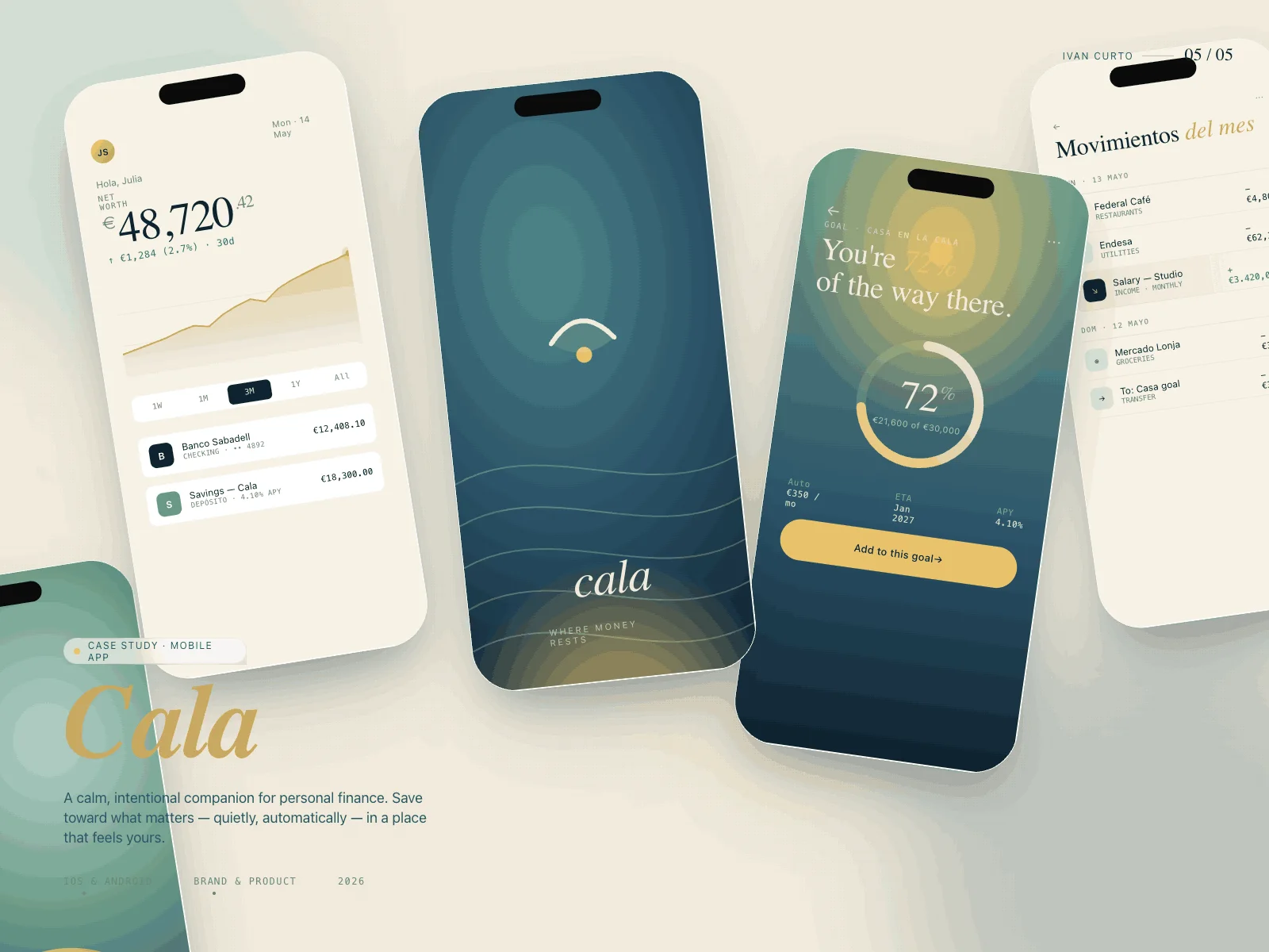
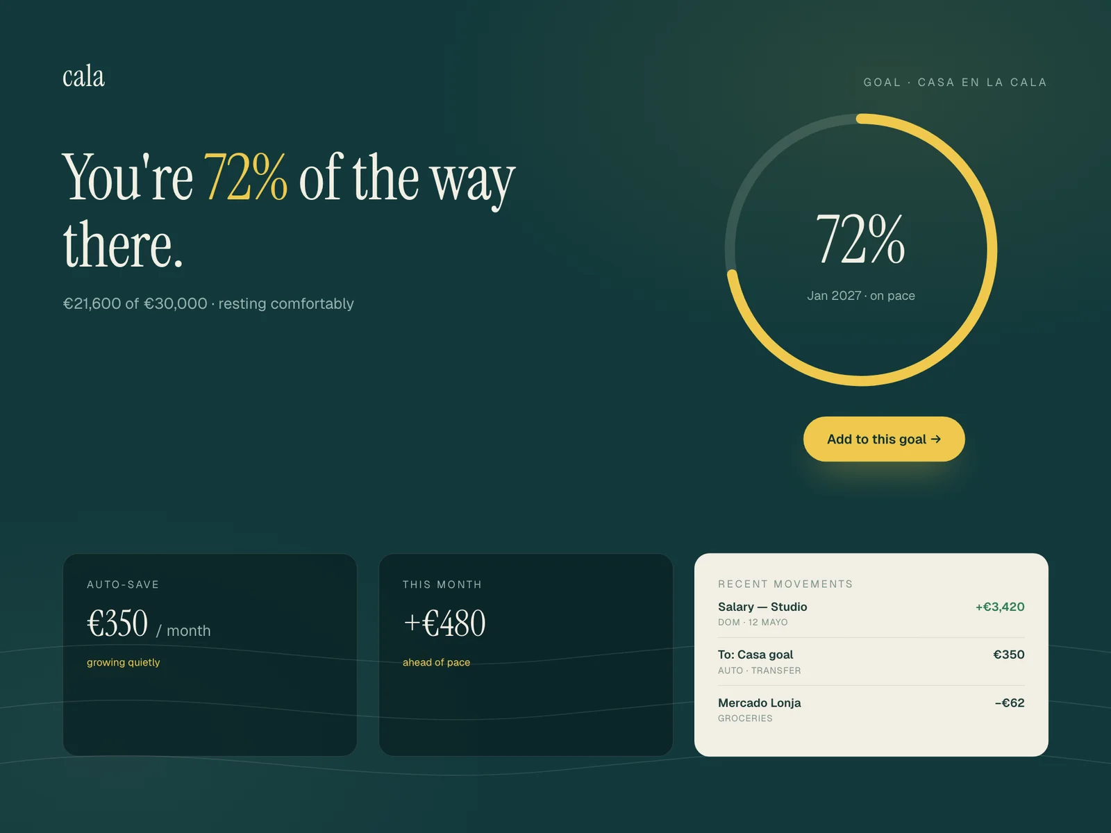
We designed around the goal, not the balance. The first thing Cala shows is progress toward something you named yourself — "You’re 72% of the way there" — set in a warm serif over deep sea-green, with the raw numbers one intentional tap away.
Every data view passed a simple test: can this screen be read at midnight without spiking anxiety? Reds were retired entirely; deltas speak in language ("resting", "growing") before they speak in percentages.
Calaisthefirstproductwhereournumbersmakepeopleexhaleinsteadoftenseup.
Aina Solervicens · Co-founder, Cala
CBuild journal
- WEEK 02
The midnight test
We added a rule to every review: can you read this screen at 00:30 after a bad day? The first transactions list failed. The red went first, then the exclamation marks.
- WEEK 05
Naming the money
Testers never said 'balance decreased'; they said 'my money is resting'. We stole their language and rewrote every state in it — the app started sounding like its users.
- WEEK 08
The two-second ritual
The deposit animation was 800ms at first, and users tapped and left. Stretched to a two-second golden fill timed to a breath, they started waiting for it — then repeating it.
DKey decisions
- 01
Goals above balances
The home screen leads with named goals and their progress arcs. The account balance exists, but it serves the story instead of being the story.
- 02
No red anywhere
Cala replaces alarm colours with warm neutrals and one candle-yellow accent. Negative movement is described, not shouted — testers stopped skipping the app on bad weeks.
- 03
The deposit as ceremony
Adding to a goal triggers a slow golden fill animation timed to a breath. A two-second ritual made the core action feel rewarding enough to repeat.
- 04
Serif voice, sans mechanics
Reflective copy is set in a serif that feels hand-placed; transactional UI stays in a neutral sans. The product switches voice exactly when its role switches.
EThe outcome
Saving became something users came back to on purpose.
- 4.2
- average weekly opens per user during the pilot
- +58%
- goal deposits versus the founders’ prototype
- 0
- red pixels in the entire interface
The pilot cohort described Cala as "the only money app that doesn’t feel like being told off." The founders now open investor meetings with the deposit animation.
A note from the build
Fintech ships fear by default. The real work on Cala was emotional, not technical: deciding the product would never raise its voice, then engineering everything backwards from that.
— Ivan Curto
Building a product people should love using daily?
Start a conversation